Interview with Rick Sternbach

Rick Sternbach first joined Star Trek in April 1978. As an illustrator, he worked alongside Mike Minor to design control panels and signage for The Motion Picture.
Almost a decade later, he was hired together with Andrew Probert to create the look of Star Trek: The Next Generation. In this capacity, he helped bring the twenty-fourth century to live. When Probert left the show at the end of the first season, Sternbach became solely responsible for designing starships and props.
With Michael Okuda, Sternbach designed the Deep Space Nine space station, and he designed the Starship Voyager on his own.
Sternbach helped rationalize many of Star Trek’s technologies. He drew the Star Trek: The Next Generation USS Enterprise 1701-D Blueprints and, with Okuda, wrote the Star Trek: The Next Generation Technical Manual. Many Star Trek fans would consider those reference works as close to canon as possible.
Of course, there is always more to learn. I reached out to Sternbach in July 2007 with questions. Here is a lightly edited version of our email exchange.
The Motion Picture

Can you tell us about working with Mike Minor and how the look of the Enterprise interior sets for The Motion Picture came about?
Mike Minor was a definite kindred spirit when it came to science fiction, and it was a lot of fun working with him. He was good pals with Bob Burns and it was through the two of them that I got to meet a number of people working in science fiction in Hollywood in the late 1970s.
Mike had produced a number of very large tempera or acrylic renderings while working on Phase II with Production Designer Joe Jennings and Lead Set Designer John Cartwright.
A lot of the foundation work on the second series changed, of course, when the project became a feature film. Joe Jennings went on to do Shogun and Harold Michelson took over as production designer. Mike continued refining some elements with Harold and got me working on control panel graphics, set labels, animation loops and the like.
The Next Generation

You and Andrew Probert were among the first artists hired for The Next Generation. Can you tell us about your early work for the series?
One of the first things we worked on was a scale model of the bridge and then, while Andy was ramping up on designing the Enterprise-D, I began sketching the crew gear, like the tricorder, communicator and phasers.
In your design of the phasers, how did you balance their function as weapons and Gene Roddenberry’s determination to downplay the militaristic aspects of Starfleet?
Gene’s only directive to me was to lose the pistol grips on the phasers; it was up to the writers to use them as Gene wanted. Though, as we know, a lot of people and critters still got vaporized at the highest settings.
Like the phaser, the tricorder was an indispensable piece of treknology that needed to be updated for the twenty-fourth century. Can you tell us about your design process?
The TNG tricorders were initially inspired by the HP-41C programmable calculators, which I found to be amazing new (at the time) pieces of technology that could do amazing numbers of functions.
The basic shape involved a button interface, sockets for plug-in modules and peripherals and a one-line display. With some twenty-fourth-century updating, the thing was perfect and evolved into a similarly-shaped and -sized device that boasted touch-sensitive controls, multifunction color display and a variety of sensors and com subsystems.
And all way before the iPod or iPhone.
The fact that it folded was partly to give the actor something interesting to do with it, since the communicator was reduced to a single solid object. The pull-out sensor was another actor “piece of business” that worked well for us.


The prop that underwent the most significant change was the communicator. Initially, the wrist-communicator concept that had been used in The Motion Picture was considered, before the device was combined with the Starfleet emblem. Could you explain how this came about?
I didn’t work on the TMP version; a lot of the prop design was handled by artists outside of Paramount or by the folks who were going to build them, if I recall. I invented a couple of twenty-third-century electronic clipboards and that was about it.
For TNG, I sketched a number of TMP-ish wrist devices, but Gene looked at the sketches and asked why the device couldn’t just be the emblem. Made sense to me; I was sort of heading in that direction with an arrowhead on a larger gizmo, thinking that they wanted chunks of equipment to handle, but Gene nailed it and we ran with it.
With the design of the Enterprise-D exterior finalized and the model being constructed at ILM, time had come to fill in the interior details. Did you contribute to the design of the bridge?
I didn’t do a lot with the interior sets, that was mostly Herman Zimmerman and Andy and the set designers. Occasionally, I would add an idea for a tech bit in the first season.
From the second season on, I was supplying large numbers of high-tech furniture designs and sickbay and science lab gear.
For Season 3, several enhancements were made to the sickbay set. What can you tell us about your contributions to this set?
I designed a few stand-alone consoles and wall units. I couldn’t tell you exactly what I drew up season-by-season without a lot of digging in the drawings, but if the set decorator needed some new bit of tech gear or table or display widget, I drew it.

Your contributions are perhaps the most obvious in the engineering details of the new ship. Could you tell us more about this?
A lot of the TNG engineering look was built upon the sets from the Star Trek feature films, with some color and shape changes to give it a new feel.
Star Trek: The Motion Picture already had a vertical warp core. Had the precize function of the warp drive system been explained yet or did you come up with the matter/antimatter reaction assembly as source of the ship’s power?
The engine systems in TMP had come together through the assistance of people like Jesco von Puttkamer at NASA, some of the designers at Bob Abel’s shop, some of us at Paramount, and it made some basic cinematic sense.
The loss of the vertical core and horizontal plasma conduit in Wrath of Khan was confusing, since all we saw there was a cylindrical sort of ash tray that lifted up and sprayed Spock with radiation.
When the time came to do TNG, Mike Okuda and I sat down over many pizzas and bowls of noodles to compile and clarify all of the information we had on impulse, warp, power generation and so on. The Original Series touched on many of these concepts but wasn’t clear or consistent, so we wrote a lot of memos which eventually became the TNG Technical Manual.
As we said, people didn’t have to read it all, and the writers didn’t have to give engineering lectures in an episode, but the answers were in the book if they were needed. I wanted to get all of this material sorted out and to have it all make sense, and a great deal of it is based on established aerospace engineering, structures and materials processing. Even twenty-third- and twenty-fourth-century engineering has its own internal consistency, driven by future concepts for high-energy fusion and antimatter devices being looked at over the last twenty years.
We didn’t stop there, since we also detailed a lot of the advances in energy storage, weapons, communications, computers and medicine. Everything a good science-fiction show uses.


Andrew Probert set aside four large windows on the underside of the Enterprise-D model for lounges. However, these “windows” are laballed as a “secondary deflector dish” in the Star Trek: The Next Generation Technical Manual. How come?
It became clear to Mike Okuda and me that during separated flight, the saucer required a deflector of some kind, though in recent years some explanations have been offered to deal with ships that have no obvious deflector dish, like the Reliant. Those underside windows on the “D” were so large that we were certain they’d never be made into a real set, so that area seemed perfect for becoming a deflector for the purpose of the Technical Manual.
Probert had designed a shuttlecraft during the first season. Why was a second design needed and how did it come about?
We always wanted to see shuttles in the shuttlebay as well as out on locations or on our planet sets, but, with the amount of compound curves on Andy’s first-season shuttle, construction was tough.
We made use of one of the Trek V shuttles by chopping a section out of the middle and giving it new engines and windows. The great thing about it, and most of the other Starfleet shuttles we built, was the fact that where there are curves, the curves follow a single bend, and “softening” the joined edges is no big deal. It was much easier to do the real set pieces that way, even if we did migrate to some ships that had no exteriors except for CGI.


The design of the Enterprise-C was based on an early Andrew Probert drawing for the “D”, is that right?
I honestly don’t recall exactly how that sketch of Andy’s was picked to be the Enterprise-C, but we should actually go back a step and be sure we’re talking about the same drawing.
There is a sketch of a ship that I assume was the one David Gerrold took in to Gene’s office, eventually becoming the Enterprise-D. A different sketch [is] also labeled as an early Enterprise-D. That ship, with some slight modifications to help in the timely construction of a miniature by Greg Jein, became the Enterprise-C, because it very much appeared at the time to have design elements between the “B” and the “D”.


Your design for the Klingon battle cruiser that appeared in “Reunion” incorporated elements from the original Klingon vessel designed by Matt Jefferies. Can you tell us more about this?
The idea here was to combine elements of the original battle cruiser (and the hyper-detailed versions from the movies) with some slight Starfleet influence, as though there was some deliberate technology-sharing between the Federation and the Klingon Empire. The color was a bit lighter and less of a saturated dark green, the wing-lines a bit curvier, but overall still recognizable as Klingon.

For “The Wounded”, you had to design a totally new Cardassian cruiser. How did that happen, and how do you feel about the style that inspired the look of subsequent Cardassian warships and space stations?
I’m a big fan of iconic shapes or more correctly shapes that somehow remind you of something without beating you over the head with it.
The Galor class started with an Egyptian ankh, given how they were like the pharaohs to the Bajoran slaves, but you don’t really see the basic shape unless you look straight down on the vessel. The little disruptor pyramids were a bit more obvious, as were the “temple” type structures on the ship’s backbone, and the sandy yellow shades.


What can you tell us about the Nebula- class starships that first appeared in “Redemption”?
Not a whole lot to tell besides mixing and matching some Galaxy-class hull parts with a new AWACS style sensor wing up on top.
I don’t recall the original VFX or script requirements for that ship, but I seem to remember we wanted to say that the saucer was smaller than the 1701-D’s saucer, so we called for a larger-scale bridge module and larger windows. Model makers like Greg Jein were always under the gun because of the TV schedule, so anything involving “found” parts was always a help.
Voyager
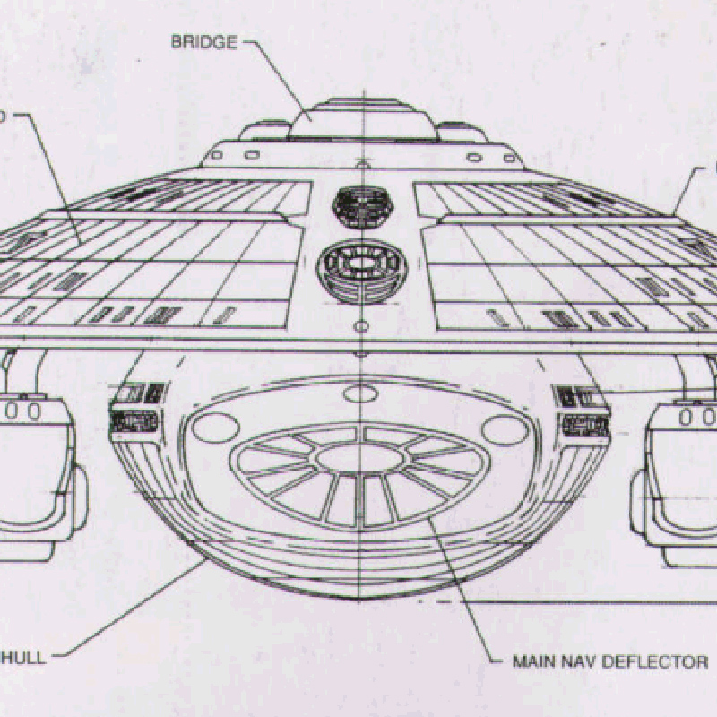
On the Voyager model, we can see two types of windows: the standard small viewports and several larger windows. On the Enterprise-D, there is a similar arrangement, in line with Andrew Probert’s idea that the larger windows would accommodate public spaces like restaurants, bars, lounges, etc. We know the large windows directly underneath the bridge service Voyager’s mess hall. Underneath those, a row of five windows appears. Did you assign these to a specific area?
The row of five is Janeway’s quarters. You see four of the five from inside the set; presumabaly #5 is the bathroom.
Other large windows appear on several locations on the saucer section, both on top and on the underside, including a row of windows directly in front of where the Aeroshuttle is supposed to be located. What areas did you assign to these windows?
The similarly-sized windows on the other decks are other officers’ quarters. We used the same interior set (Janeway’s) with different numbers of windows. We used removable wall segments to make a three-window quarters, two-window, etc. We did similar things on The Next Generation in exactly the same basic area on Stage 8.
On the front of the Voyager model, there is a prominent sensor strip. There are, however, also sensor strips on the rim of the saucer. Why did you include an additional sensor area on top of the primary hull?
The big sensor pallet acreage was put there just to break up the otherwise featureless surface and to give another scale cue that Voyager was a smaller ship. Individual surface features, like the windows, appeared larger compared to the overall size of the ship.
On the Voyager MSD, an observation lounge appears in the far aft section of the ship, right under the main shuttlebay. What was your intention for this area?
Pretty much that: an observation lounge or similar function.